Before/After share: My take on the r/kitchenremodel post “Thoughts on how this remodel came out?”—what works, what I’d steal, and the tiny tweaks that would make a good kitchen feel great.
What hooked me
I clicked in expecting a standard “we finally finished!” post and left thinking, yep, this is how you make a space feel calmer and more capable without going maximal. The thread (titled exactly that: “Thoughts on how this remodel came out?”) reads like a homeowner gut-check: “Here’s where we landed—what do you see?” That openness is half the charm.
Here’s what stood out to me, as someone who nerds out on workflows, lighting layers, and the little details that decide whether you love cooking here…or just love photographing it.
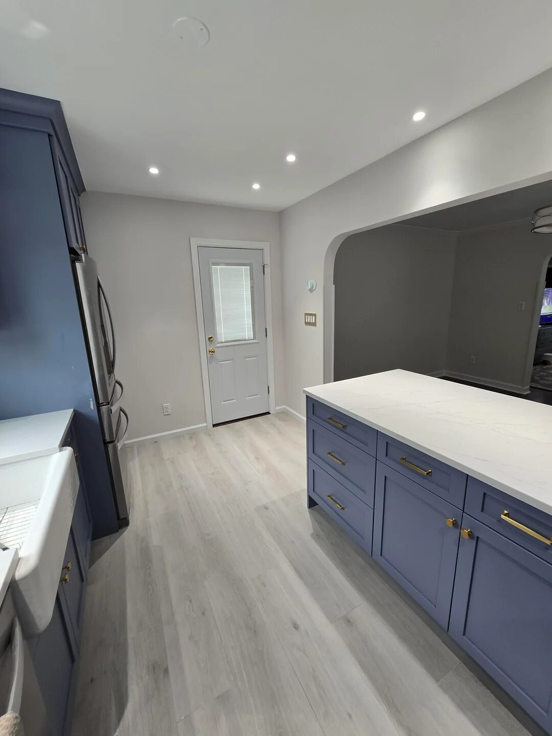
The layout feels deliberate (and that’s everything)
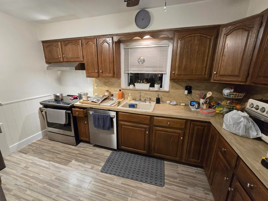
Great kitchens aren’t only about cabinet colour—they’re about movement. In the photos, you can feel the friction has been engineered out: clear prep stretches either side of the sink/cooktop, sensible landing zones, and no “hip checks” to squeeze past an island corner. In NKBA language, the classic work triangle looks tight without being cramped: each leg ideally 4–9 ft, with a total under ~26 ft so you’re not doing laps to grab milk or drain pasta. That’s the invisible difference between pretty and pleasant to live with.
Steal this: Before you choose a tile, measure your triangle and the aisle widths. For one main cook, ~42 in aisles hit the ergonomic sweet spot; go ~48 in if two of you regularly tag-team.
Storage discipline > more boxes
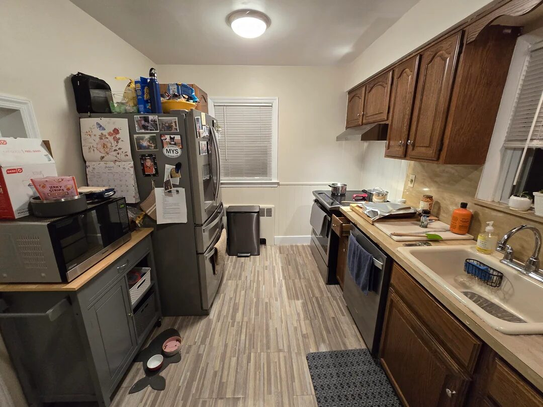
What I appreciate here is restraint. Instead of throwing wall units at every inch, they’ve allowed some breathing space—places for your eyes (and elbows) to rest—then concentrated storage where it pays back: tall pantry runs, deep drawers at prep height, and a sensible “drop zone” near the fridge. That balance is what makes a kitchen read as designed, not just filled.
Steal this: Prioritise drawers over doors for anything below the worktop (you’ll use the back of a drawer; you’ll forget the back of a cupboard). Keep a landing area within a step or two of the fridge and hob for hot pans and shopping bags.
Lighting: layered, dimmable, and not trying too hard
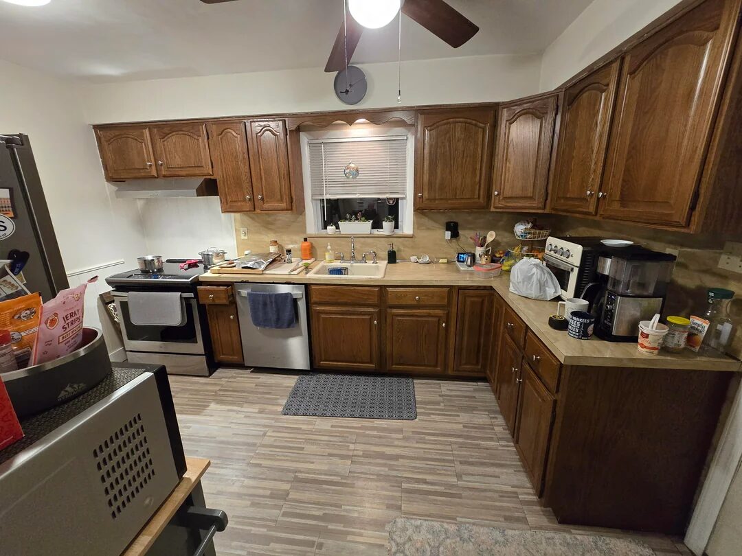
Even if you only have a handful of fixtures, the mix matters. This reno gets the ambient/task/accent trio right: ceiling lights to wash the room, under-cabinet task to kill shadows at the board, and a touch of personality up top (pendants or a character flush-mount). The net effect: the kitchen looks expensive even if the fittings weren’t.
Steal this: Put task and ambient on separate dimmers. It’s the cheapest way to make a room feel “tuned” to mornings vs. late-night tea.
Ventilation done like you mean it
Photos can’t show air quality, but your nose will. If you’ve re-planned cabinetry or tightened the envelope, venting to the outside with a fan that actually moves air is non-negotiable. As a rule of thumb, plan for ≥100 CFM local exhaust at the hood (and more for wide or high-BTU cookers), keep duct runs short/straight, and pick a noise level you’ll tolerate with guests in the room—or you simply won’t use it.
Steal this: Template the duct route during design, not at install day. A perfect hood that dumps into a tortuous 90-degree maze won’t meet spec in the real world.
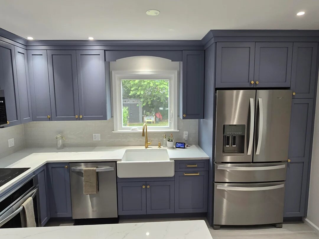
The finish story is cohesive, not copy-paste
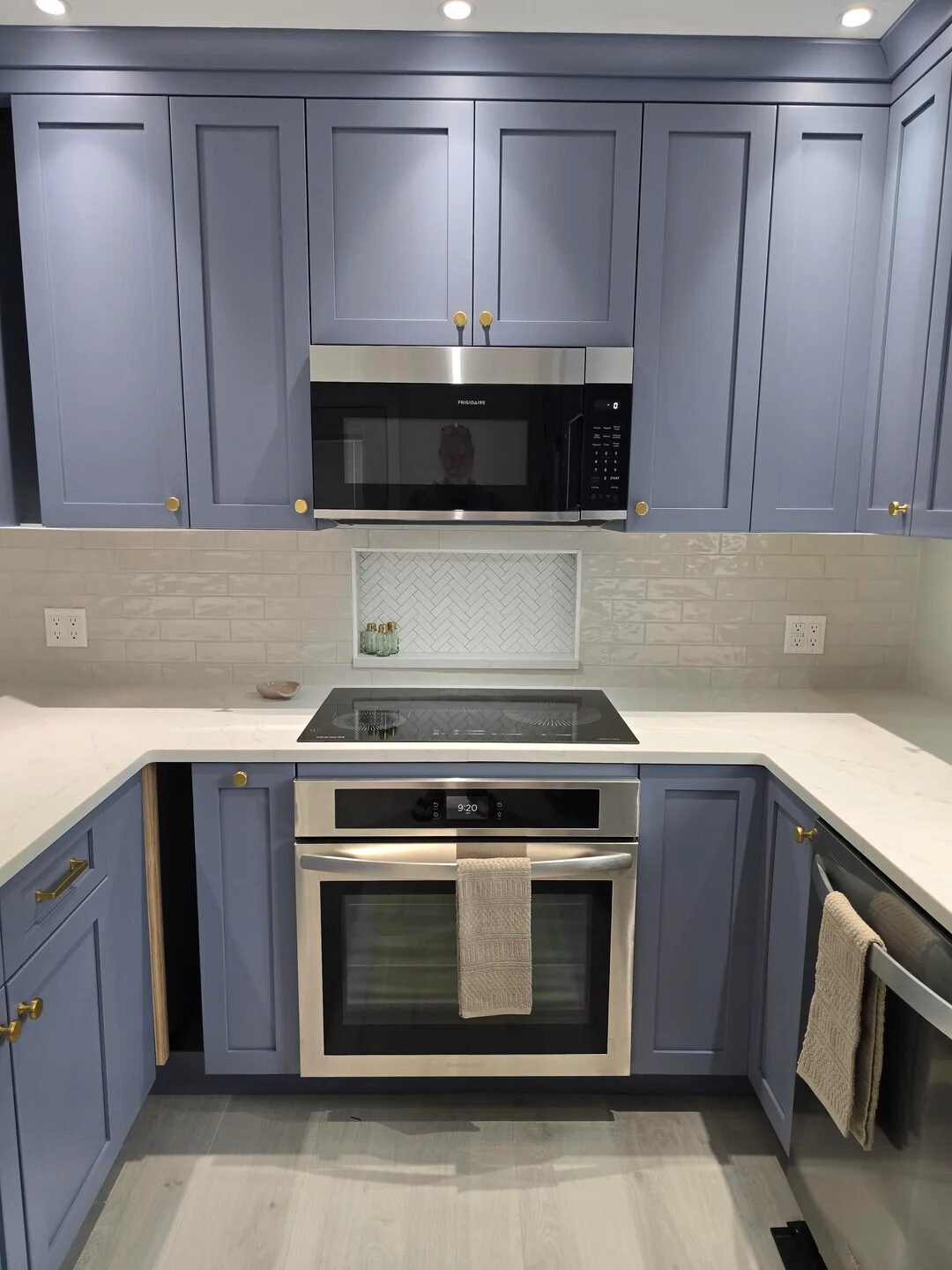
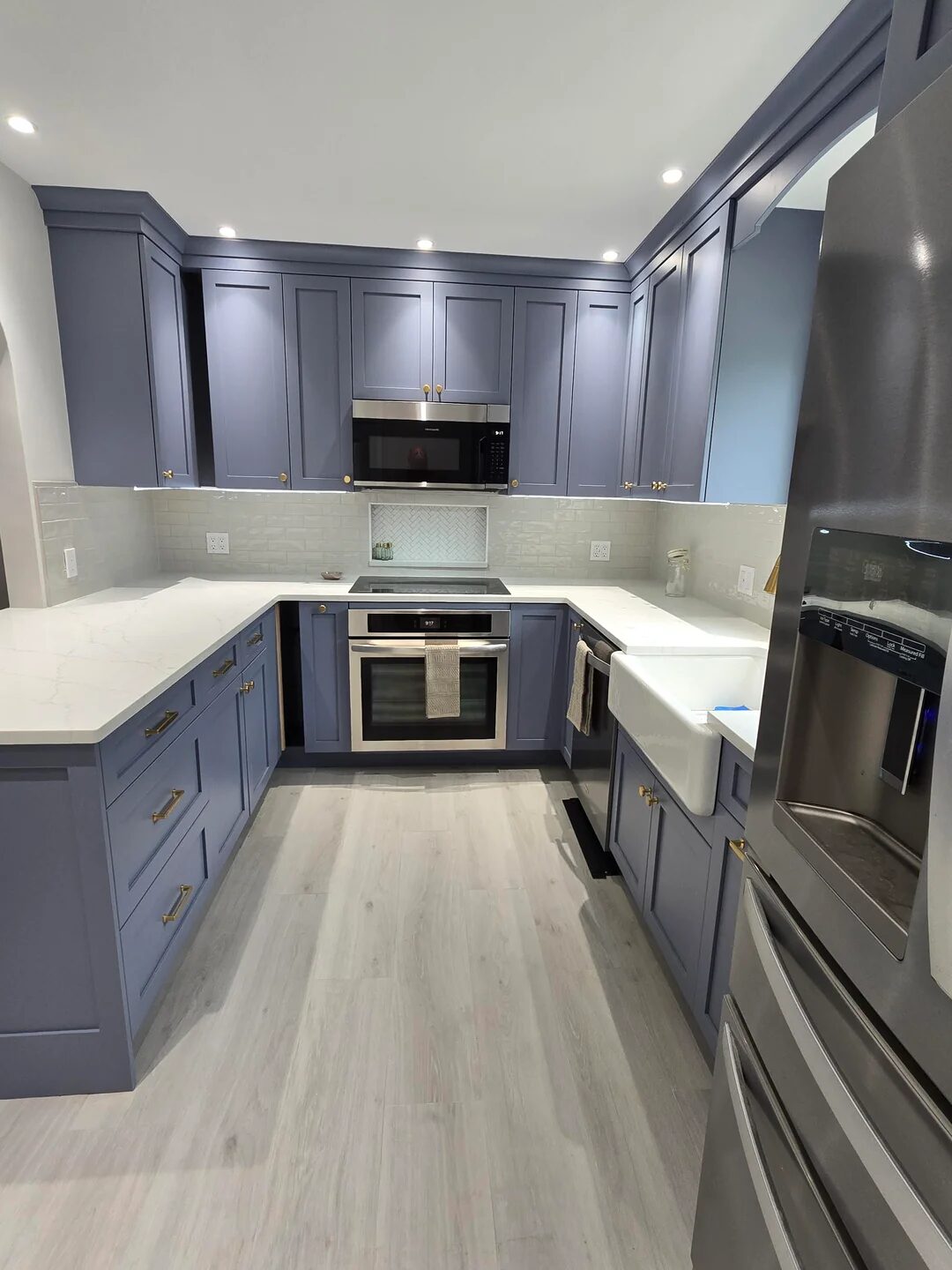
What makes the space feel “grown up” is a single idea carried well—tone-on-tone cabinetry with texture in the splash, or a quiet cabinet colour with a hero metal (brass or chrome—pick one and commit). There’s personality, but it’s edited. One star, many supporting actors.
Steal this: Choose one moment to shout (tile pattern or bold colour or statement range), then let everything else harmonise. Your eye—and resale—will thank you.
The last 2% is where kitchens become keepers
Trim alignment, end-panel reveals, the way a pendant centres on the island—this is where a good job becomes a great one. If you’re still mid-project, plan a “snag list” week: adjust doors and drawer gaps, add door bumpers, silicone the sink perimeter neatly, and tune dimmer ranges so they don’t flicker at low levels.
Steal this: Photograph every wall before closing—services, studs, and ducting. Future-you (and your electrician) will be grateful when you add a plug or rail in a year’s time.
If I were advising a friend doing this next month…
Do this first:
-
Draw your triangle; check legs are 4–9 ft and the total is ≤26 ft. Adjust the island or fridge position until it works on paper.
-
Lock your appliance sizes early so cabinets fit reality, not wishful thinking.
-
Specify external venting and target ≥100 CFM (or the manufacturer’s guidance for your cooker), with a duct path agreed before drywall.
-
Map lighting as ambient/task/accent on separate circuits. Add dimmers.
Then keep yourself honest with a tiny checklist:
-
Aisles 42–48 in depending on number of cooks.
-
24–30 in clear landing space beside sink and hob.
-
Tall storage grouped (not peppered everywhere) to keep sightlines calm.
-
Hood noise you’ll actually use—spec the sone rating, don’t guess.
-
Final week reserved for “snags”: align, level, silicone, touch-ups.
Final thought
What I love about this project—and why the thread drew such engaged feedback—is that it proves a point: good kitchens feel easy. You can see the line from idea → layout → lighting → finish without detours. If you copy nothing else, copy that discipline: measure the movement, respect the triangle, light the tasks, vent the room, and let one design idea lead. The rest is just cabinetry.
Source: the Reddit thread titled “Thoughts on how this remodel came out?” sparked this breakdown. I’m layering in widely accepted planning standards (NKBA spacing/triangle) and ventilation best-practice so the takeaways are genuinely useful when you plan your own space.
Leave a Reply