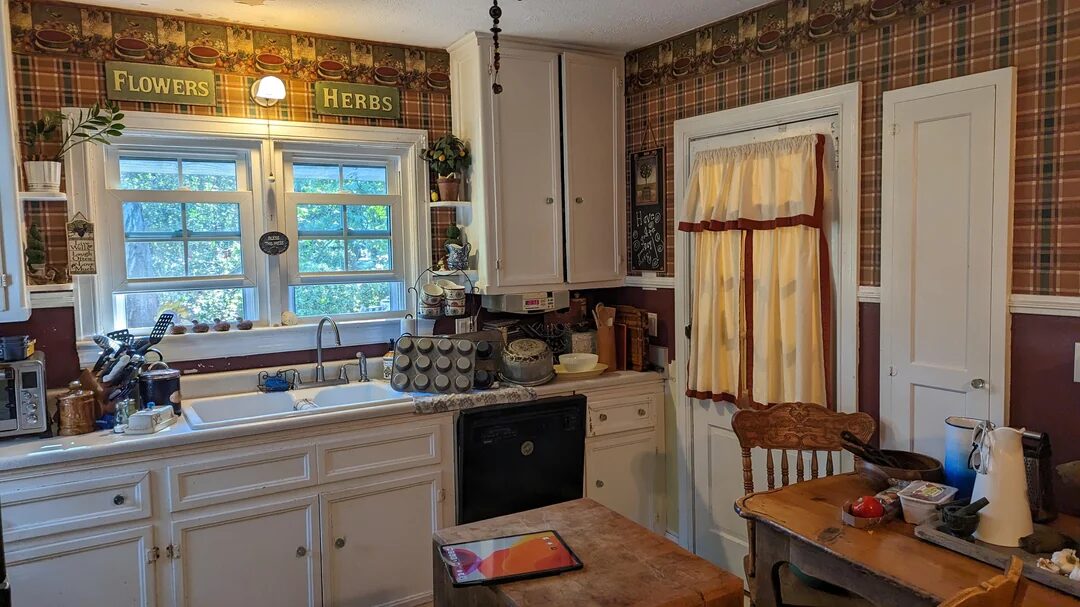
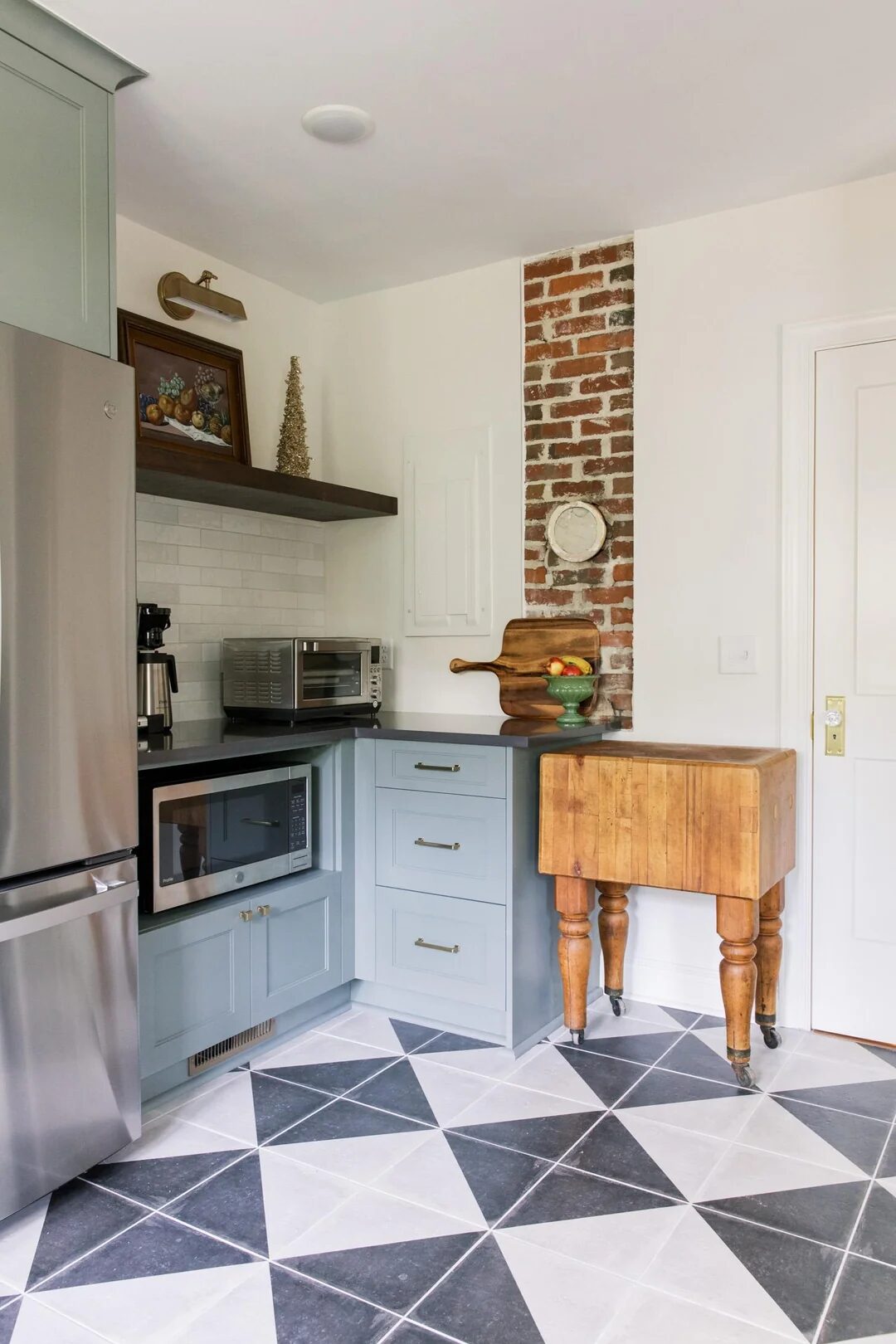
I’m sharing this remodel because it captures my favorite kind of transformation: honor the house, upgrade the experience. The “before” was classic time-capsule—busy wallpaper, a failing ceiling, and a crowded checkerboard floor. The “after” keeps the soul (exposed brick! a vintage butcher-block table on casters!) while delivering modern function, clean light, and calm color.
What makes this remodel sing
-
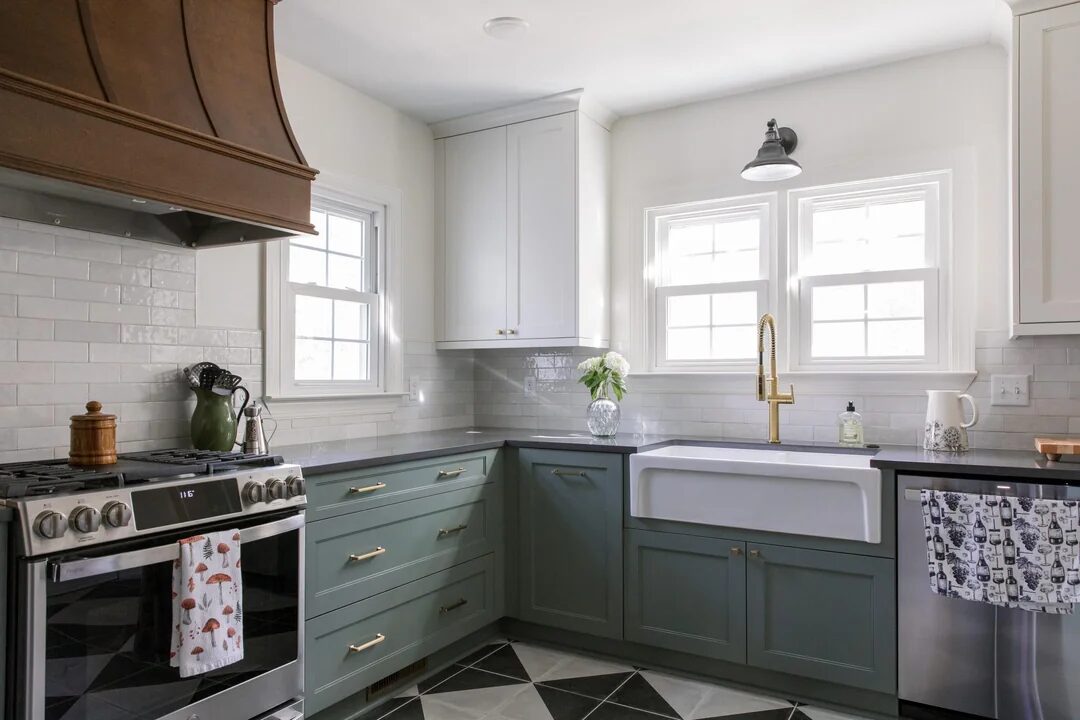
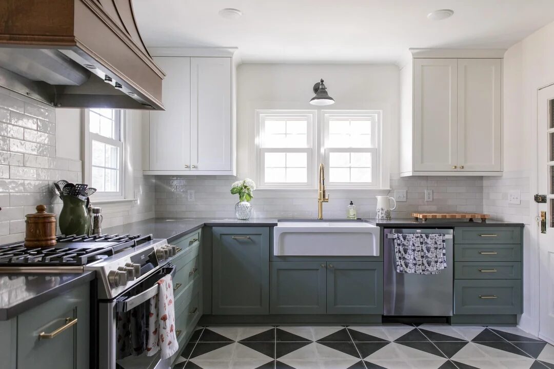
A palette that feels period-right, not theme-park. Muted sage/blue-green base cabinets play beautifully with clean white uppers and charcoal countertops.
-
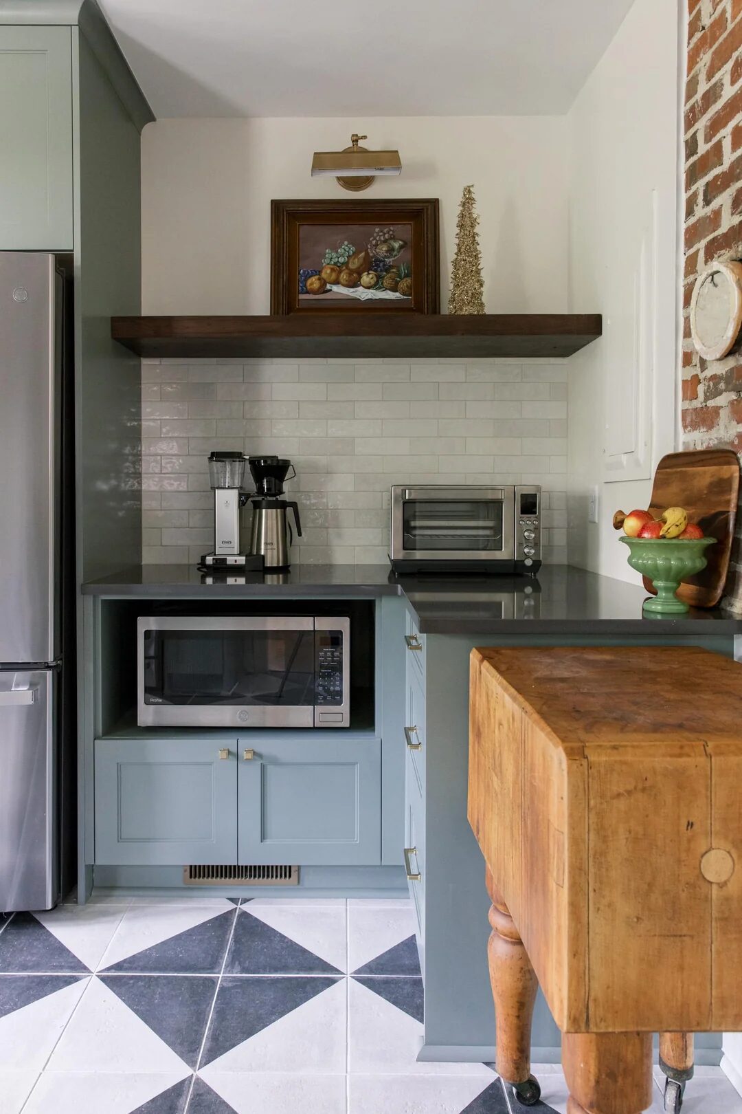
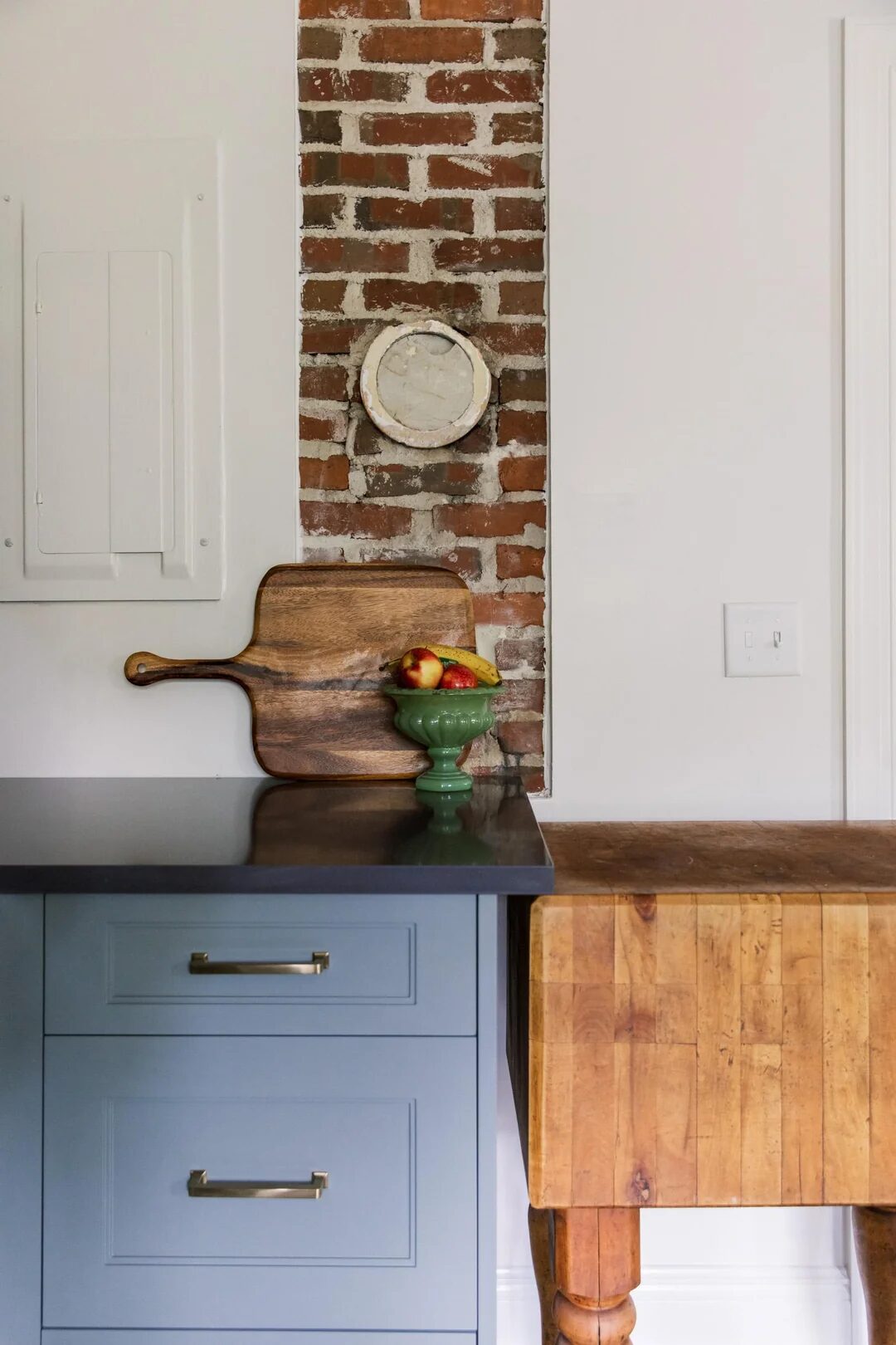
Texture where it matters. A narrow slice of exposed brick chimney becomes the room’s memory line. Beside it, the old butcher-block adds warmth and history.
-
A floor with presence. Large geometric tiles in black/white/gray ground the room and visually widen it without overwhelming the cabinetry.
-
Updated, layered lighting. Recessed cans for general light, an industrial-style sconce over the sink, under-cabinet glow for task work, and a small picture light above the open shelf—each layer earns its keep.
-
Hardware that warms everything up. Soft-brass pulls and a spring-neck faucet add just enough shine.
-
A hood with character. A patinated metal (or wood-clad) hood reads like furniture and anchors the range wall.
Smart layout choices you can copy
-
Real work zones. The farmhouse sink sits under double windows with generous landing space; the range is tucked into its own run; the fridge + small-appliance station share a corner so morning coffee doesn’t cross the cooking path.
-
Built-in small-appliance garage. Microwave and toaster oven live low and close to the fridge and sink, with dedicated outlets and a toe-kick vent—clutter gone, workflow up.
-
Drawers over doors. Deep drawers near the range keep pots, lids, and baking sheets at hip height.
-
Open shelf where it counts. One thick wood shelf with a picture light provides display without committing to a whole wall of dust-catchers.
Before → After: the big wins
-
From visual noise to calm. The plaid wallpaper, tiny trim, and chipped ceiling are replaced by smooth plaster, light subway tile, and simplified millwork.
-
From cramped to coherent. The checker floor and scattered furniture give way to continuous cabinetry and a bold patterned tile that guides the eye.
-
From aging fixtures to durable upgrades. A modern range, full-depth sink, and quality faucet make daily work easier and faster to clean.
Materials & finishes (how to recreate the vibe)
-
Cabinetry: Shaker doors; lowers in muted sage/blue-green, uppers in soft white.
-
Counters: Charcoal quartz (reads matte to satin in photos).
-
Backsplash: Subtle gray/greige subway tile with slight sheen.
-
Metal finishes: Brushed or satin brass for hardware and faucet; dark patina for the hood/sconce.
-
Floor: Large-format geometric porcelain or cement tile in black/white/gray.
-
Heritage touch: Keep any exposed brick or original butcher block if you have it—seal for wipeability and celebrate the imperfections.
Practical notes (so it works as good as it looks)
-
Vent & power first. Run a proper hood vent; place GFCI outlets exactly where appliances live (including inside the microwave/toaster niche).
-
Match color temperature. 2700–3000K lighting keeps food looking delicious and plays nicely with warm wood and brass.
-
Mind the reveals. Even gaps (⅜–¾ in.) around doors/drawers and the sink apron are what make a kitchen read “custom.”
-
Protect the brick. Seal with a breathable masonry sealer so it won’t shed dust near food zones.
Leave a Reply